
- Home
- SEODiscover the latest updates from across the United States, including politics, culture, economy, and trending stories. Stay informed on the key events shaping the nation and the topics everyone’s talking about.
- Technical SEOLearn technical SEO concepts including crawling, indexing, XML sitemaps, robots.txt, canonical tags, site architecture, and website performance.
- Local SEOOptimize your business for local seo with Google Business Profile, local citations, reviews, maps, and location-based SEO.
- Mobile SEOImprove your website’s mobile seo performance with responsive design, mobile-first indexing, usability, and page speed optimization.
- On-Page SEOExplore on-page seo optimization techniques such as title tags, meta descriptions, headings, URLs, internal linking, and content optimization.
- Off-Page SEODiscover off-page SEO strategies such as backlinks, digital PR, brand mentions, outreach, and authority building.
- SEO ToolsExplore the best SEO tools for keyword research, technical audits, backlink analysis, rank tracking, and website optimization.
- Core Web VitalsLearn how to improve Core Web Vitals including LCP, INP, CLS, page speed, and overall user experience for better rankings.
- Keyword ResearchLearn how to find profitable keywords, analyze search intent, evaluate competition, and build effective keyword strategies.
- Link BuildingMaster ethical link building techniques, backlink analysis, outreach methods, guest posting, and authority growth strategies.
- Google Search ConsoleLearn how to use Google Search Console to monitor indexing, fix errors, analyze search performance, and improve SEO.
- SEO BasicsLearn the fundamentals of search engine optimization (SEO Basics), including how search engines work, SEO terminology, and beginner-friendly best practices.
- Paid Media
- Display AdvertisingLearn display advertising strategies, banner ads, audience targeting, remarketing, Google Display campaigns, and optimization techniques.
- Google AdsLearn Google Ads strategies, campaign setup, bidding, keywords, Performance Max, Search Ads, and optimization techniques.
- LinkedIn AdsLearn LinkedIn Ads strategies for B2B marketing, lead generation, audience targeting, campaign optimization, and paid social advertising.
- Meta AdsLearn Meta Ads strategies for Facebook and Instagram, including campaign setup, targeting, retargeting, and performance optimization.
- Paid Media AnalyticsLearn paid media analytics, including CPC, CTR, CPA, ROAS, conversion tracking, attribution, reporting, and campaign performance analysis.
- PPC StrategyLearn effective PPC strategies, campaign planning, bidding, keyword targeting, landing pages, conversion optimization, and more.
- ContentTransform your living spaces with inspiration, tips, and trends in interior design. From minimalist decor to bold statements, find ideas for every style and budget.
- Social
- Digital MarketingExplore stories and advice on living your best life. From personal growth to entertainment, dive into the latest in lifestyle trends and inspiration.
- Artificial IntelligenceStay informed about health and wellness with expert advice, fitness tips, and the latest medical breakthroughs. Your guide to a healthier and happier life.
- DevelopmentYou will find development related educational articles
- GTMLearn Google Tag Manager (GTM) with practical guides for tags, triggers, variables, tracking, conversions, and website analytics implementation.
- HTMLLearn HTML with simple tutorials, examples, tags, elements, attributes, and best practices for building modern web pages.
- HTML CSSLearn HTML CSS together with practical tutorials, examples, layouts, styling techniques, responsive design, and modern web development practices.
- HTML JSLearn HTML JS – JavaScript with practical tutorials and examples for adding interactivity, dynamic content, events, and functionality to web pages.
- JavaScriptExplore JavaScript tutorials, examples, concepts, and practical techniques for creating interactive and dynamic websites and web applications.
- PHPLearn PHP programming with practical tutorials, examples, functions, syntax, and web development techniques for beginners and developers.
- PythonLearn Python programming with practical tutorials, examples, syntax, functions, automation techniques, and useful programming concepts.
- Home
- SEODiscover the latest updates from across the United States, including politics, culture, economy, and trending stories. Stay informed on the key events shaping the nation and the topics everyone’s talking about.
- Technical SEOLearn technical SEO concepts including crawling, indexing, XML sitemaps, robots.txt, canonical tags, site architecture, and website performance.
- Local SEOOptimize your business for local seo with Google Business Profile, local citations, reviews, maps, and location-based SEO.
- Mobile SEOImprove your website’s mobile seo performance with responsive design, mobile-first indexing, usability, and page speed optimization.
- On-Page SEOExplore on-page seo optimization techniques such as title tags, meta descriptions, headings, URLs, internal linking, and content optimization.
- Off-Page SEODiscover off-page SEO strategies such as backlinks, digital PR, brand mentions, outreach, and authority building.
- SEO ToolsExplore the best SEO tools for keyword research, technical audits, backlink analysis, rank tracking, and website optimization.
- Core Web VitalsLearn how to improve Core Web Vitals including LCP, INP, CLS, page speed, and overall user experience for better rankings.
- Keyword ResearchLearn how to find profitable keywords, analyze search intent, evaluate competition, and build effective keyword strategies.
- Link BuildingMaster ethical link building techniques, backlink analysis, outreach methods, guest posting, and authority growth strategies.
- Google Search ConsoleLearn how to use Google Search Console to monitor indexing, fix errors, analyze search performance, and improve SEO.
- SEO BasicsLearn the fundamentals of search engine optimization (SEO Basics), including how search engines work, SEO terminology, and beginner-friendly best practices.
- Paid Media
- Display AdvertisingLearn display advertising strategies, banner ads, audience targeting, remarketing, Google Display campaigns, and optimization techniques.
- Google AdsLearn Google Ads strategies, campaign setup, bidding, keywords, Performance Max, Search Ads, and optimization techniques.
- LinkedIn AdsLearn LinkedIn Ads strategies for B2B marketing, lead generation, audience targeting, campaign optimization, and paid social advertising.
- Meta AdsLearn Meta Ads strategies for Facebook and Instagram, including campaign setup, targeting, retargeting, and performance optimization.
- Paid Media AnalyticsLearn paid media analytics, including CPC, CTR, CPA, ROAS, conversion tracking, attribution, reporting, and campaign performance analysis.
- PPC StrategyLearn effective PPC strategies, campaign planning, bidding, keyword targeting, landing pages, conversion optimization, and more.
- ContentTransform your living spaces with inspiration, tips, and trends in interior design. From minimalist decor to bold statements, find ideas for every style and budget.
- Social
- Digital MarketingExplore stories and advice on living your best life. From personal growth to entertainment, dive into the latest in lifestyle trends and inspiration.
- Artificial IntelligenceStay informed about health and wellness with expert advice, fitness tips, and the latest medical breakthroughs. Your guide to a healthier and happier life.
- DevelopmentYou will find development related educational articles
- GTMLearn Google Tag Manager (GTM) with practical guides for tags, triggers, variables, tracking, conversions, and website analytics implementation.
- HTMLLearn HTML with simple tutorials, examples, tags, elements, attributes, and best practices for building modern web pages.
- HTML CSSLearn HTML CSS together with practical tutorials, examples, layouts, styling techniques, responsive design, and modern web development practices.
- HTML JSLearn HTML JS – JavaScript with practical tutorials and examples for adding interactivity, dynamic content, events, and functionality to web pages.
- JavaScriptExplore JavaScript tutorials, examples, concepts, and practical techniques for creating interactive and dynamic websites and web applications.
- PHPLearn PHP programming with practical tutorials, examples, functions, syntax, and web development techniques for beginners and developers.
- PythonLearn Python programming with practical tutorials, examples, syntax, functions, automation techniques, and useful programming concepts.
Now Reading: How to Fix Mobile Usability Issues in Search Console
-
01
How to Fix Mobile Usability Issues in Search Console
- Home//
- SEO//Discover the latest updates from across the United States, including politics, culture, economy, and trending stories. Stay informed on the key events shaping the nation and the topics everyone’s talking about.
- Technical SEO//Learn technical SEO concepts including crawling, indexing, XML sitemaps, robots.txt, canonical tags, site architecture, and website performance.
- Local SEO//Optimize your business for local seo with Google Business Profile, local citations, reviews, maps, and location-based SEO.
- Mobile SEO//Improve your website’s mobile seo performance with responsive design, mobile-first indexing, usability, and page speed optimization.
- On-Page SEO//Explore on-page seo optimization techniques such as title tags, meta descriptions, headings, URLs, internal linking, and content optimization.
- Off-Page SEO//Discover off-page SEO strategies such as backlinks, digital PR, brand mentions, outreach, and authority building.
- SEO Tools//Explore the best SEO tools for keyword research, technical audits, backlink analysis, rank tracking, and website optimization.
- Core Web Vitals//Learn how to improve Core Web Vitals including LCP, INP, CLS, page speed, and overall user experience for better rankings.
- Keyword Research//Learn how to find profitable keywords, analyze search intent, evaluate competition, and build effective keyword strategies.
- Link Building//Master ethical link building techniques, backlink analysis, outreach methods, guest posting, and authority growth strategies.
- Google Search Console//Learn how to use Google Search Console to monitor indexing, fix errors, analyze search performance, and improve SEO.
- SEO Basics//Learn the fundamentals of search engine optimization (SEO Basics), including how search engines work, SEO terminology, and beginner-friendly best practices.
- Paid Media//
- Display Advertising//Learn display advertising strategies, banner ads, audience targeting, remarketing, Google Display campaigns, and optimization techniques.
- Google Ads//Learn Google Ads strategies, campaign setup, bidding, keywords, Performance Max, Search Ads, and optimization techniques.
- LinkedIn Ads//Learn LinkedIn Ads strategies for B2B marketing, lead generation, audience targeting, campaign optimization, and paid social advertising.
- Meta Ads//Learn Meta Ads strategies for Facebook and Instagram, including campaign setup, targeting, retargeting, and performance optimization.
- Paid Media Analytics//Learn paid media analytics, including CPC, CTR, CPA, ROAS, conversion tracking, attribution, reporting, and campaign performance analysis.
- PPC Strategy//Learn effective PPC strategies, campaign planning, bidding, keyword targeting, landing pages, conversion optimization, and more.
- Content//Transform your living spaces with inspiration, tips, and trends in interior design. From minimalist decor to bold statements, find ideas for every style and budget.
- Social//
- Digital Marketing//Explore stories and advice on living your best life. From personal growth to entertainment, dive into the latest in lifestyle trends and inspiration.
- Artificial Intelligence//Stay informed about health and wellness with expert advice, fitness tips, and the latest medical breakthroughs. Your guide to a healthier and happier life.
- Development//You will find development related educational articles
- GTM//Learn Google Tag Manager (GTM) with practical guides for tags, triggers, variables, tracking, conversions, and website analytics implementation.
- HTML//Learn HTML with simple tutorials, examples, tags, elements, attributes, and best practices for building modern web pages.
- HTML CSS//Learn HTML CSS together with practical tutorials, examples, layouts, styling techniques, responsive design, and modern web development practices.
- HTML JS//Learn HTML JS – JavaScript with practical tutorials and examples for adding interactivity, dynamic content, events, and functionality to web pages.
- JavaScript//Explore JavaScript tutorials, examples, concepts, and practical techniques for creating interactive and dynamic websites and web applications.
- PHP//Learn PHP programming with practical tutorials, examples, functions, syntax, and web development techniques for beginners and developers.
- Python//Learn Python programming with practical tutorials, examples, syntax, functions, automation techniques, and useful programming concepts.
How to Fix Mobile Usability Issues in Search Console

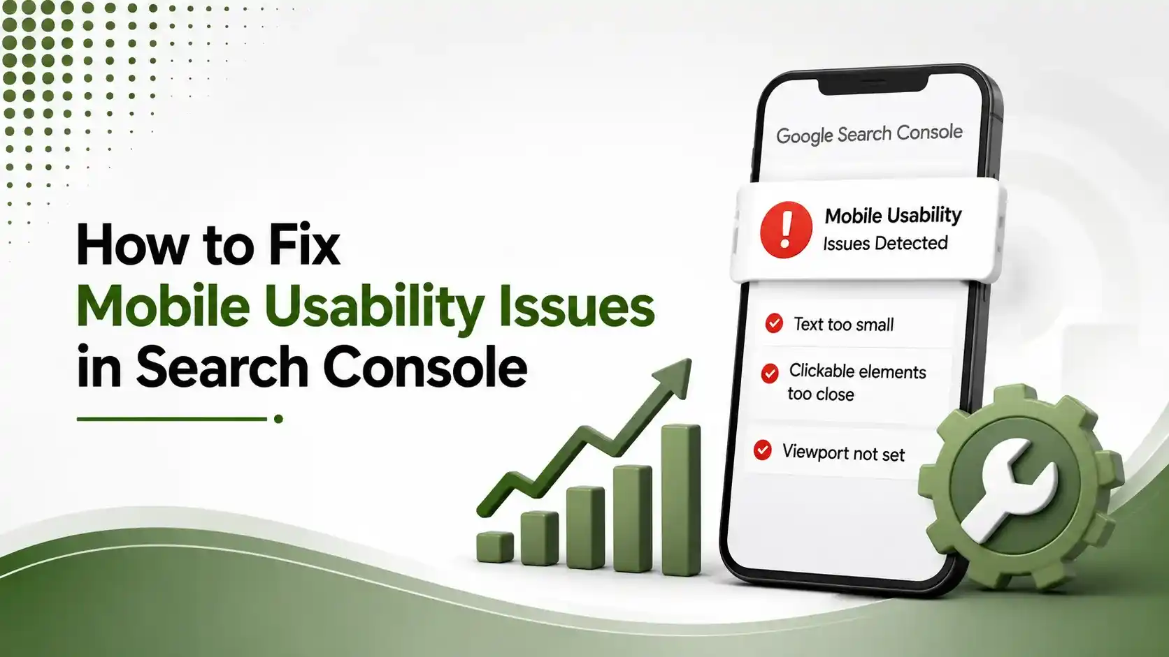
Google Search Console helps identify mobile usability problems that can affect rankings and user experience. This guide explains how to diagnose common mobile errors, fix responsive design and viewport issues, improve touch usability, and ensure your website meets Google's mobile-friendly standards.
Table of Contents
ToggleGoogle's Mobile Usability report doesn't guess. It tests your actual pages the way Googlebot Smartphone sees them and lists exactly four things that can go wrong: text too small, elements too close together, content wider than the screen, or a missing viewport tag. Every fix below is copy-pasteable CSS, not vague advice.
We flagged this report as one of the most-ignored tools in our common mobile SEO mistakes guide. This is the follow-up: the actual fix for each error type Search Console can flag.
Each error maps to a specific, well-documented CSS pattern. None require a full redesign. Most are a handful of lines added to a global stylesheet.
One honest caveat before you start: Google's mobile crawler occasionally reports false positives. Always verify a flagged issue on a real phone before spending time fixing something that may not actually be broken.
01Text Too Small to Read
According to Sadekur Rahman's 2026 complete guide to fixing mobile usability errors, Google flags body text smaller than 12px, though a 16px minimum is the safer, more comfortable target.
According to a real Adobe Community discussion on this exact error, sites sometimes get flagged even with reasonable font sizes set, which is one reason verifying with the URL Inspection tool matters before assuming a fix worked.
/* Use relative units so text scales properly across devices */
body { font-size: 1rem; } /* 16px baseline */
h1 { font-size: 2rem; }
h2 { font-size: 1.5rem; }

/* Avoid: fixed pixel values that don't scale well */
p { font-size: 14px; } /* Too small for mobile */
rem units respect the user's browser settings; fixed px values don't
02Clickable Elements Too Close Together
According to Rankture's guide to fixing mobile usability errors, Google recommends a minimum 48x48 pixel tap target, with adequate spacing so a fingertip can't accidentally span two links at once.
/* Minimum 48px tap target for buttons and links */
button, .button, a.cta {
  min-height: 48px;
  min-width: 48px;
  padding: 12px 24px;
}

/* Navigation list items need spacing between them */
nav ul li { margin-bottom: 8px; }
nav ul li a { display: block; padding: 12px; }
Draw a mental 48x48px box around every tap target; boxes shouldn't overlap
03Content Wider Than the Screen
According to PQINA's guide to fixing mobile usability issues with a CSS snippet, this often happens when an image or embedded element lacks a width attribute, or when CSS fails to load entirely and Googlebot sees the raw, unstyled HTML.
/* A defensive base layer that prevents horizontal overflow */
:where(img, video, iframe, pre) {
  max-width: 100%;
  overflow: auto;
}
:where(body) {
  word-break: break-word;
}
The :where() selector applies with zero specificity, so your own stylesheet can still override it
04Viewport Not Set
According to Synup's guide to finding and fixing mobile usability issues, a missing viewport tag forces browsers to render a zoomed-out desktop view, which is the root cause behind several other mobile usability errors at once.
<!-- Place in the head of every page template -->
<meta name="viewport" content="width=device-width, initial-scale=1">
If this exists but is misconfigured, check that width=device-width is included exactly
05Error Fixer, Tap to Explore
Tap each error type for a one-line summary of the fix.
Text Too Small to Read
Set a base font size of at least 16px using rem units. Avoid fixed pixel values that don't scale across devices.
06Verifying and Validating the Fix
Use the URL Inspection tool to check whether the specific fixed page now renders correctly.
Click "Validate Fix" inside the Mobile Usability report once changes are live across affected pages.
Test on an actual phone, not just Chrome DevTools' responsive mode, to catch anything a simulator misses.
Wait for revalidation; Google re-crawls affected URLs over the following days, not instantly.
According to EtaSolution's guide to fixing mobile usability issues in Search Console, revisiting the report a week after clicking Validate Fix confirms whether Google actually accepted the changes, rather than assuming the process worked and moving on.
07Where These Errors Usually Come From
According to Leadraft Marketing's guide to Google Search Console and mobile usability issues, most of these errors trace back to a desktop-first template that was later adapted for mobile, rather than one built responsively from the start.
According to 24x7 WP Support's step-by-step guide to fixing clickable element errors, WordPress themes purchased years ago frequently predate current mobile usability standards, making them a common source of recurring flags even after individual fixes.
08Common Causes Behind Each Error
| Error | Frequent Root Cause |
|---|---|
| Text too small | Fixed px font sizes inherited from a desktop-first template |
| Elements too close | Dense navigation menus or inline link lists with no spacing |
| Content wider than screen | Images without width attributes, or CSS failing to load |
| Viewport not set | Missing template tag, or a JavaScript error blocking the head |
09FAQs on Fixing Mobile Usability Issues
Text too small to read, clickable elements too close together, content wider than the screen, and viewport not set. Together these cover the vast majority of flagged issues.
Use the URL Inspection tool to check the specific page, then click "Validate Fix" in the Mobile Usability report. Google re-crawls affected pages over the following days.
48 by 48 pixels, with enough spacing between adjacent elements that a fingertip can't accidentally span two tap targets at once.
Yes, occasionally. Always verify a flagged issue on an actual mobile device before investing time fixing something that may render correctly in practice.
This often happens when CSS fails to load for Googlebot specifically, or when an image or embed lacks explicit width attributes, causing overflow only in that scenario.
Related Articles
What We Learn Today
Four error types cover nearly every Mobile Usability flag
Use rem units and a 16px minimum to avoid text-too-small flags
48x48px is the minimum recommended tap target size
max-width:100% and overflow:auto prevent horizontal overflow
The viewport meta tag is required on every single page template
Always verify flagged issues on a real device before fixing
Complete Your Mobile SEO Audit
Fixing usability flags is one piece of the puzzle. Pair this guide with our mobile SEO checklist and common mistakes guide for a genuinely complete mobile audit.
Related Posts
Previous Post
Next Post
Previous Post
SEO2 months ago
Common Mobile SEO Mistakes to Avoid in 2026
Next Post
Mobile SEO2 months ago
Mobile UX Best Practices for SEO



- Artificial Intelligence
- Content
- Core Web Vitals
- Development
- Digital Marketing
- Display Advertising
- Google Ads
- Google Search Console
- GTM
- HTML
- HTML CSS
- JavaScript
- Keyword Research
- Link Building
- LinkedIn Ads
- Local SEO
- Meta Ads
- Mobile SEO
- Off-Page SEO
- On-Page SEO
- Paid Media
- Paid Media Analytics
- PHP
- PPC Strategy
- Python
- SEO
- SEO Basics
- SEO Tools
- Social
- Technical SEO